

Activision
User Experience Design Internship
the brief
In Summer 2023, I had the privilege of joining Activision Blizzard King as a UX Design Intern. I collaborated with Solid State Studio’s UX team and had the chance to work on their highly anticipated title, Call of Duty: Warzone Mobile!
As part of the UX team, I took on a major project involving designing a core feature for the game’s Events and Live Operation services. This challenge pushed me to apply and refine my design thinking, delivering a feature seen by millions of players.
My primary responsibilities included creating wireframes, developing functional prototypes for user studies, and collaborating with other UX & Game Designers to ensure our designs met stakeholder needs.
role
UX Design
UX Research
timeline
Jun 2023 - Sep 2023
skills
Figma
Wireframing
Prototyping
team
Kingsley Chau (UXD)
Timothy Hequibal (UX Lead)
Elaine Teh (Sr. UXD)
+many stakeholders

the context
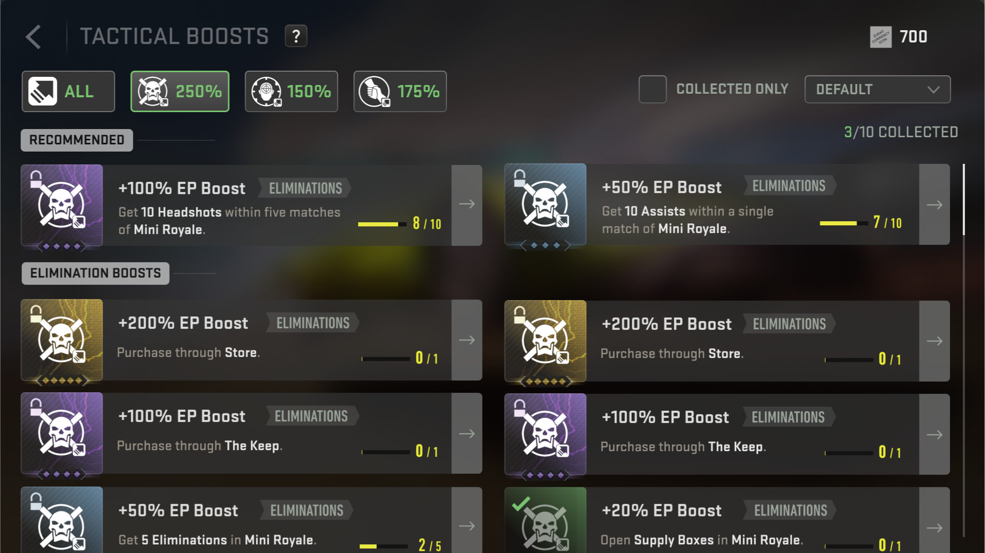
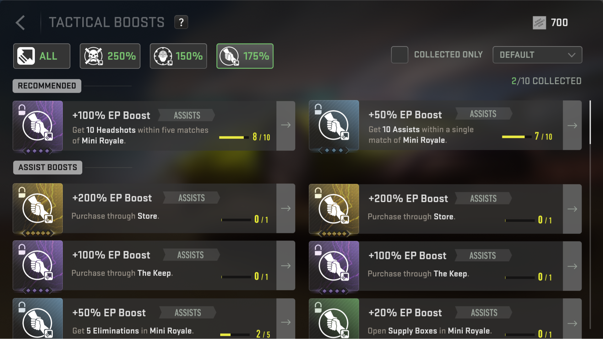
A core feature I worked on during my time at Activision was the “Tactical Boosts” page, an essential part of Warzone Mobile's Events system. Tactical Boosts allow players to multiply event points, allowing them to earn rewards at a faster pace!
My challenge was to lead a full redesign of the Tactical Boosts page, where players could view which boosts they had earned and how to unlock more! With up to 50 visually similar icons, it was critical that I could create an intuitive design that allowed players to quickly scan a small phone screen.

establishing core issues
To kick off the project, I identified several core UX issues & key questions that guided my search for design solutions:
1
Lack of Sorting Clarity
Players struggled to understand the sorting method and how these boosts were being ordered.
evaluating solutions
After immersing myself in the design team to fully understand the studio's workflow and game context, I began creating low-fidelity wireframes to present potential solutions to my team and stakeholders. While not all of the solutions were immediately applicable to the feature's needs, the process helped me better grasp the UX challenges at hand and refine my approach!

Player Progression
Emphasizes clear progression for the player to strive towards, but players have trouble recognizing key differences & relations.

prototyping designs
Moving forward, I incorporated feedback to iterate on my solutions and began developing high-fidelity mockups and prototypes in Figma! While I wasn’t able to test my designs with the public player base due to privacy constraints, I worked with the neighboring Game Design teams, who provided critical insights in understanding how players might process information!
The immediate issues I aimed to resolve was player progression and reducing repetitive information while maintaining clarity. Additionally, stakeholders emphasized the need to highlight paid premium boosts and progression recommendation so I found ways to integrate that into the design as well.
2
Unclear Progress Tracking
Players found it difficult to track which boosts they had unlocked and which ones they should progress towards unlocking.
3
Boosts Appear Too Similar
Although each boost is unique, their similar visuals made it challenging to recognize key differences.
2
4
Information Overload
The sheer volume of information on such a small screen was overwhelming, making it hard to focus on what’s a priority.
1

Sorting by Main Categories
Clearly organizes boosts into three primary categories, improving progression visibility. However, it does not effectively communicate that each boost is unique.
3
Boosts as Unique Items
Boosts are sorted and arranged as unique singular items. However, there is an overload of repeated information, cluttering the interface.


After another round of internal testing & feedback, I determined a list of what features of the low-fidelity mockups were effective in solving the design problems at hand.
1
Filtering UI System
Designed a clear filtering system that allows players to easily sort & view boosts by category. Improved navigation and information overload.
2
Recommended Tab
Introduced a dedicated tab for progression recommendations, guiding players towards what objectives to aim for unlocking next!
3
Horizontal Display
Boosts are displayed as horizontal rows, maximizing screen space and scrolling, and allowing each item to have their own space!
4
No Reiteration
Consolidated redundant information, ensuring each boost is displayed uniquely while maintaining clarity and avoiding clutter!


key learnings
-
Don’t shy away from presenting bold, out-of-the-box ideas! Even if they get rejected, ideating freely allows for more meaningful design innovations rather than settling for minor, surface-level changes that are ultimately meaningless.
-
When in doubt, look toward competitors and similar products! Closely studying how they may have succeeded and failed their audiences can provide valuable insights and help guide my own decisions when designing solutions.
-
Flexibility is key in UX Design. While the user should always be at the forefront of any design, balancing creative ideas with stakeholder priorities ensures that the final design can be successful for all parties!