
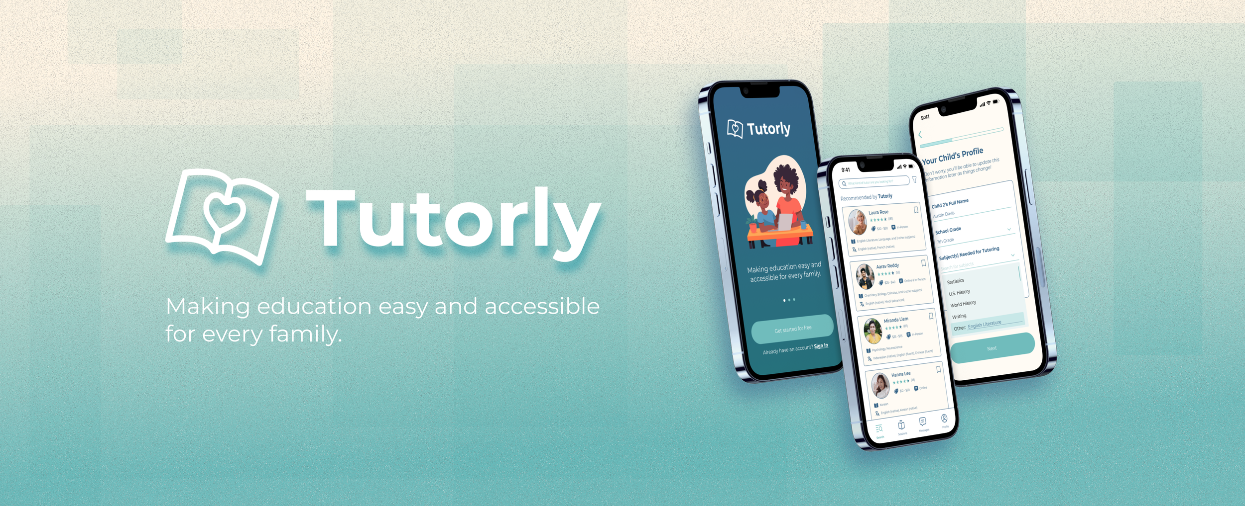
Tutorly
Designing ways to connect tutors & parents!
the brief
As a part of Google’s UX Design Certificate course, I embarked on a project to design a mobile application that enables tutors to list their services & parents to search for and book time with tutors!
With this project, my goal was to streamline the process for both parents & tutors, as well as make educational support more efficient and accessible for everyone!
the challenge
Ensuring children have access to the educational support they need is key. However, finding the best tutor can be challenging for parents, and tutors often struggle to reach clients that best suit their expertise.
The challenge lies in designing a platform that effectively meets the needs of both user groups: parents seeking reliable tutoring and tutors looking to efficiently connect with students.
roles
UX / Product Design
User Research
timeline
4 Weeks
(September 2024)
tools
Figma
Adobe Photoshop
team
Solo Project
Guidance by Google’s UX Course

empathize
conducting user interviews
I kicked off the design process by conducting user interviews, speaking individually with 3 tutors and 3 parents. My object was to understand the common challenges both groups faced, and to identify what factors made existing tutor-parent-tutee relationships successful.
I determined a set interviewees based on target characteristics, making it a point to include participants of diverse race, ethnicity, and socioeconomic backgrounds to ensure inclusivity and equity was kept in mind. I also developed two distinct interview scripts tailored to the unique perspectives of parents and tutors.
user personas & research insights
Using my interview findings, I created four personas (two for tutors, two for parents), so I could ensure my designs remained closely connected with real users and their unique challenges. Creating these personas was a key part of my design process, as I was always making decisions with these four humans in mind! Meet them below, they’re all lovely:


define
After conducting the necessary interviews and steps to fully understand my users, I began to define the parameters and goals with my project. I wanted to answer questions about the purpose of my designs, as well as what help my work might be able to offer to the world.
problem statements
Laura is a retired tutor who needs an easy way to find new students as she’s struggling with the old-fashioned way of library bulletin boards.
Aarav is a young student tutor who needs an organized schedule because he often gets confused when he schedules with his tutees on so many different platforms.
Liwei is an immigrant parent who needs to connect with tutors fluent in Chinese because he wants to stay involved in his children’s education progress.
Annie is a single mother who needs an easy way to match with tutors because she does not have a lot of spare time outside of work to do so.
value propositions
hypothesis statements
If Laura has an intuitive mobile application where she can easily view requests, then she will be able to find students easily.
If Aarav has a single dedicated platform to communicating with tutees and a calendar, he will be able to have a more streamlined schedule.
If Liwei can easily see what languages a tutor can speak, he will be able to connect better with his children’s teachers in his native language.
If Annie has access to a mobile application that automatically matches you with tutors tailored to your needs & preferences, she will be able to find tutors easily.
Tutors can view one clean space for all their students & requests.
Tutors can clearly state their pricing, policies, expertise for parents to view.
Parents can be instantly matched with tutors that suit their children’s needs.
Parents can view & chat with tutors easily to test compatibility before purchase.
ideate
goal statement
After identifying a set of key needs and values during the “define” stage of my design process, I went on to write a goal statement to guide my design solutions around. For this project, that goal statement was:
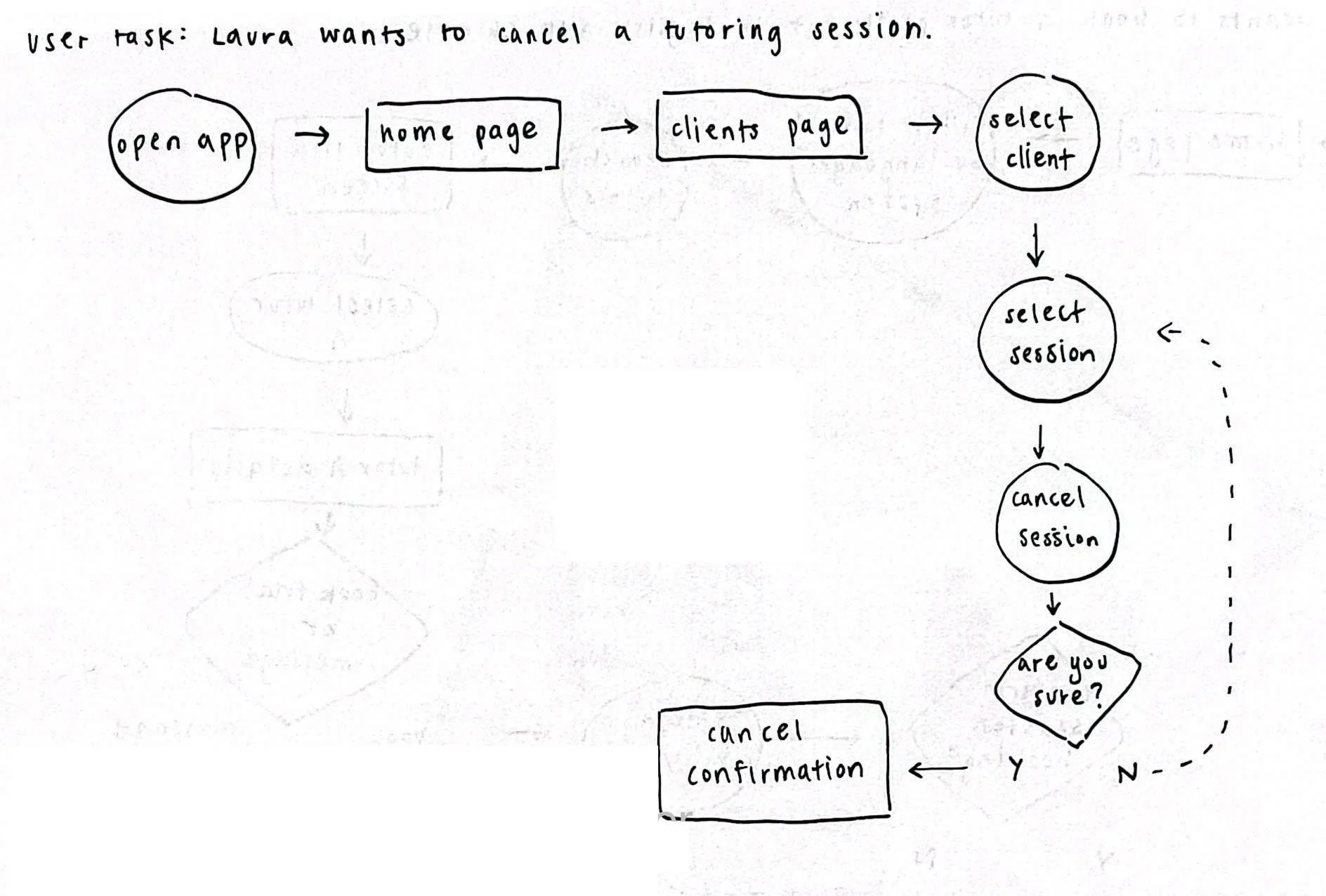
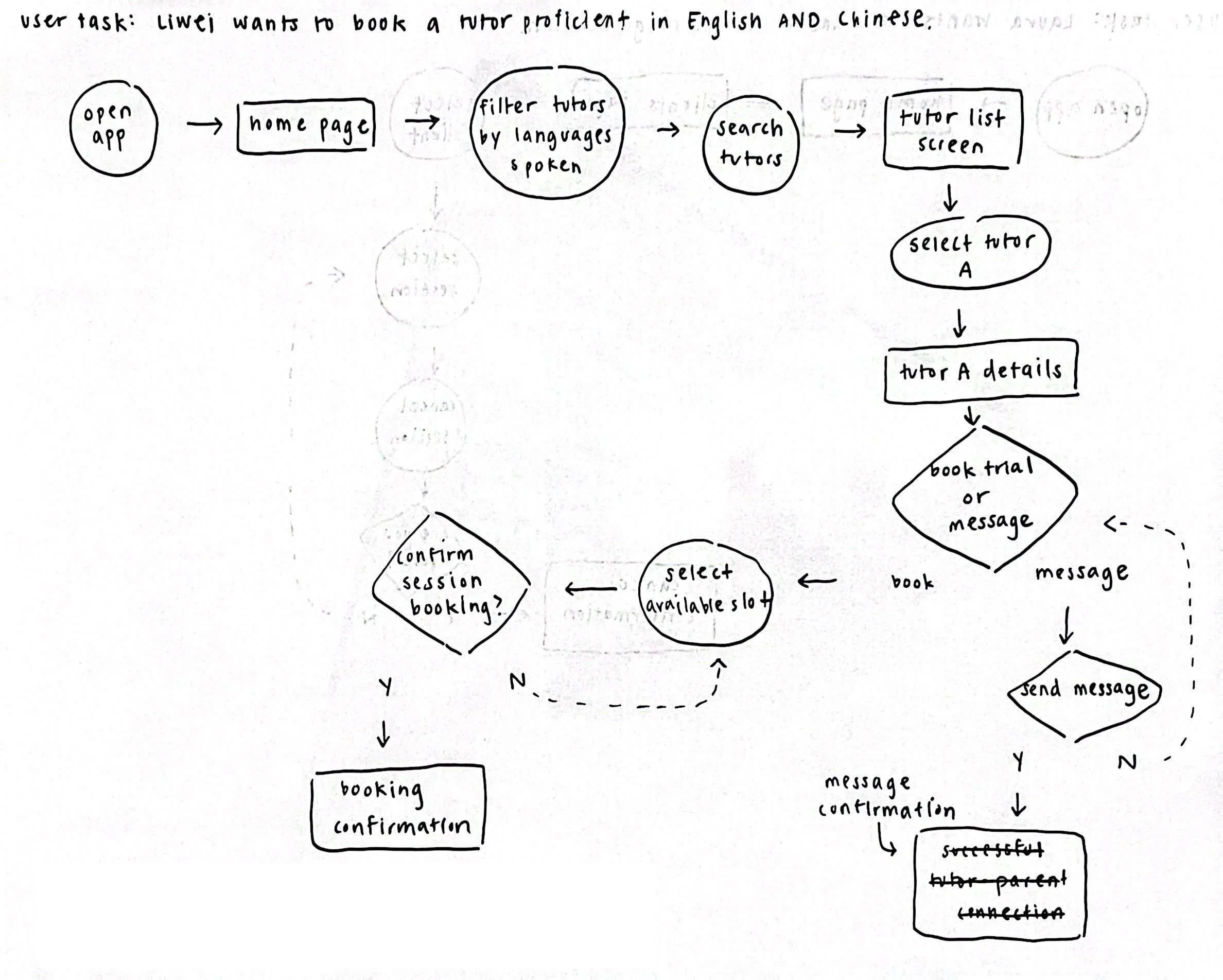
user flows
To begin the ideation for my mobile app design and user experience, I decided to map out three key tasks and interactions through a user flow. Visualizing these user flows helped to provide me a solid framework for the following steps of my design process. It also helped me identify and address a couple clunky and unintuitive bits of my design that I had in mind.
information architecture
I went on to establish a clear information architecture with a mobile sitemap outlining the main screens and their features, ensuring an intuitive, user-friendly navigation. I also gathered feedback to make adjustments that better aligned with user expectations!

“Our tutoring mobile application will make finding tutoring services easier which will affect tutors who need clients and parents who need tutors, by allowing tutors to input their characteristics & policies and allowing parents to match with tutors they deem fit.”
prototype
low-fidelity mockups
I began to prototype the user flows outlined above by sketching out wireframes with pen and paper. Starting out with simple, lo-fi paper mockups allowed me to ideate quickly and freely without any pressure of perfection. Once I was satisfied with a range of design options, I translated the best ones into a lo-fi digital mockup to begin the prototyping process. All digital mockups and prototypes I’ve created in this project was done through Figma!


test
usability testing
I conducted usability tests using my click-through prototype with 6 users to assess the product’s current state of user experience. Each user spent about 10 minutes navigating the prototype and voicing any thoughts they had with minimal guidance from me.
Based on their feedback, we made several adjustments to the prototype — some of the key changes are outlined below!
feedback & iterations

Some users mentioned that the confirmation pop-up didn't make much sense to them. I realized that for confirmation to be effective, users should be able to easily review the details they entered, instead of blindly confirming.

change #2
I also received feedback that users wanted the questionnaire to include an "Other" option with certain questions, allowing them to provide input if the available choices did not apply or resonate.

change #1
change #3
Users also mentioned during testing that the way tutors were filtered and recommended was a bit confusing. To solve this issue, I reworked and added a filtering screen and also highlighted compatible aspects of tutors.
final product design

key learnings
-
My biggest takeaway from this project was the importance of slowing down. While efficiency is valuable, I learned great design work comes from taking the time and effort early in your design process to slow down and empathize with your users. This way, you’re able to set your product up for long-term success!
-
Another lesson that stood out to me was keeping my designs simple and purpose-driven. I have previously gotten carried away by adding nice but unnecessary features. I learned that designing for the user’s needs — not just my own excitement — was key to creating a meaningful product.
-
User tests and iterations played a critical role in this project. Constantly reaching out to parents, tutors, and peers to look over my designs at every stage significantly helped me in making constant improvements and catching pain points early on.