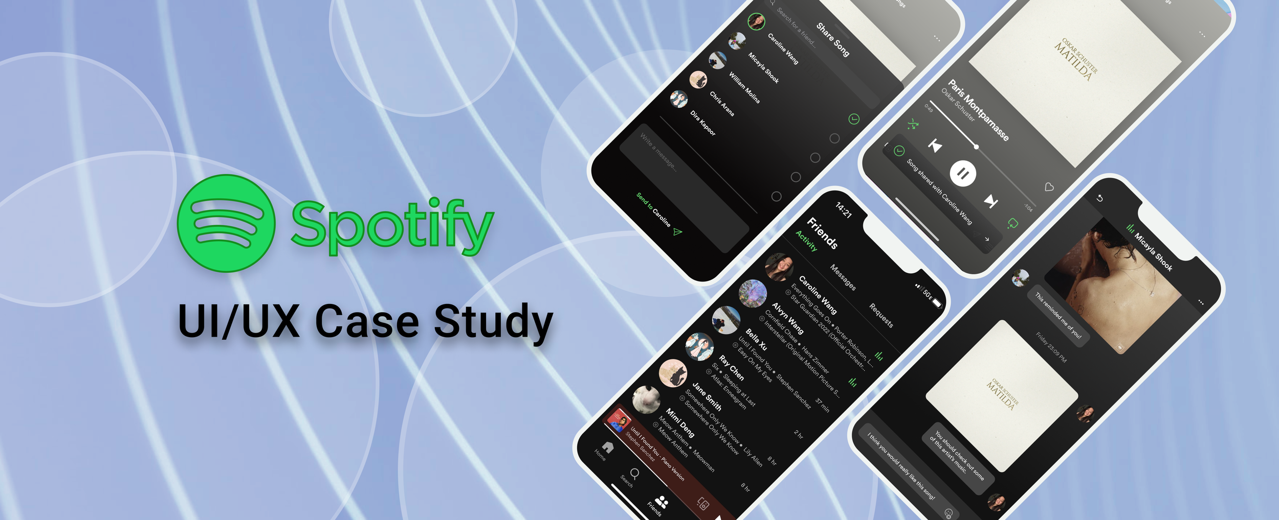
Spotify
UX Case Study
the brief
During my 3rd year at UCLA, I took a Cognitive Science course titled “Fundamentals of User Experience”.
The final project in this class was to examine and re-design an existing product relevant to college students. I chose Spotify as my product and spent 4 weeks researching and designing a feature that my peers felt was lacking from the product!
role
UX Design
Product Design
User Research
timeline
4 weeks
skills
Figma
Prototyping
User Interviews
advisor
Professor Viyehni Fuchser
the process
problem statement
Users want to connect with their friends through music but lack an easy, seamless way to share songs directly within the Spotify app.
Currently, Spotify users rely on third-party apps or workarounds to share songs with friends, creating unnecessary friction in their experience.
How might we create a streamlined, in-app solution that allows users to easily share songs and view their friends’ listening activity in real time?
proposed solution
An integrated messaging & music sharing feature within Spotify’s mobile app.
This feature would allow users to easily send songs to friends & family and view their listening activity in real-time, fostering a community for a more social and connected music experience! All without the need of moving to a third-party messaging system to connect.
user interviews
I began my design process by interviewing 5 college students (all daily Spotify users) to better understand their experience with the product. After gathering their thoughts, I was able to boil down my research findings using affinity mapping into a few key points that guided my design solutions! My major insights were…
“I love sharing my favorite songs with friends and being able to bond over similar music tastes.”
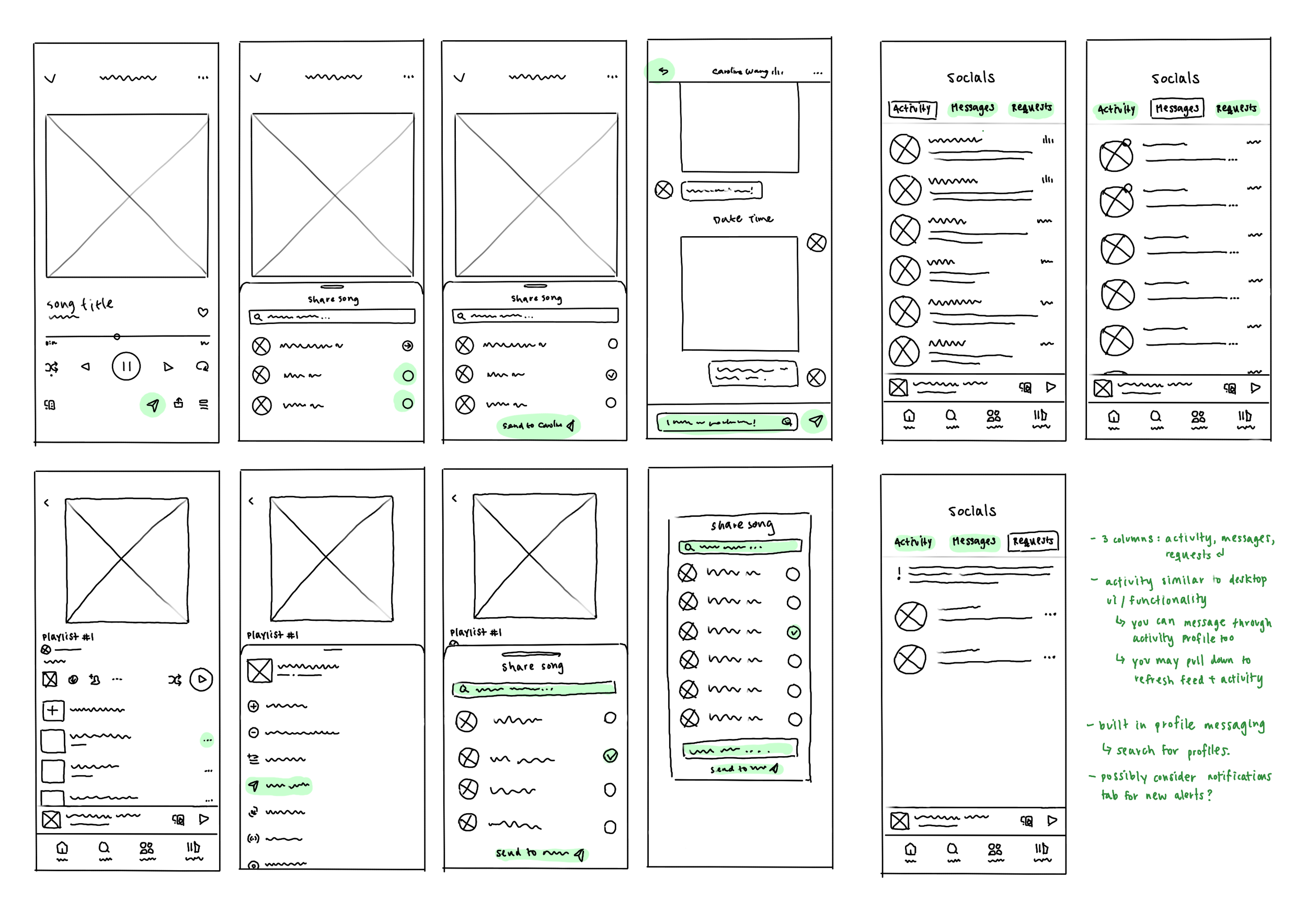
low fidelity wireframes
After gathering the main insights, I was able to define my design goal: users want to connect with their friends through music as conveniently as possible.
I explored various layouts for key pages along the user journey by sketching low-fidelity wireframes. I determined that the best solution would involve adding two key features:
usability test walkthroughs
I tested the prototypes with five more college students, conducting a cognitive walkthrough to assess usability. I focused primarily on task-based questions, observing how they navigated the prototype and encouraging them to voice their expectations and note any surprises that occurred during their experience.
After these sessions, I identified a few key weak points for improvement to guide my next few design iterations…
final prototype
“I sometimes wish I was able to share music with friends through the app directly.”
“I check what my friends are listening to a lot and follow some of their playlists!”
“I’m always creating playlists for my friends so I can share what songs remind me of them!”
1
In-App Song Share
Allowing users to directly send songs to friends within the Spotify app, simplifying music sharing without the need for third party platforms!
2
Live Activity View
Users can view their friends’ real-time listening activity on mobile, allowing them to stay more engaged within their community!
Other Sharing Methods
Users still wanted a way to share songs through other platforms in case their friends didn’t have Spotify. To address this, I re-integrated old sharing methods.
2
1
Pop-Up Confirmation
Some users voiced they were unsure whether or not they had completed the task. To reinforce that a message has been sent, I added a pop-up confirming!
3
Request Categorization
“Messages” and “Requests” being separate categories alongside “Activity” under a “Friends” tab was confusing, so I nested requests under messages!
key learnings
-
Don’t get too fixated on the specific feature you're designing — although you should always set out to solve a specific design problem, make sure you don't overlook what your product already provides. Sometimes, allowing users to have a wide range of options (including existing ones) will allow them to stay satisfied.
-
During user interviews, it's important to take time to understand not just what the user pain points are, but also what users already love about the given product! Finding ways to amplify these positive aspects can be just as impactful as solving design issues.
-
When conducting usability tests, allow users to navigate the prototype with as little guidance from you as possible. Observing how someone naturally interacts with a design offers incredibly valuable insights into usability and expectations.


